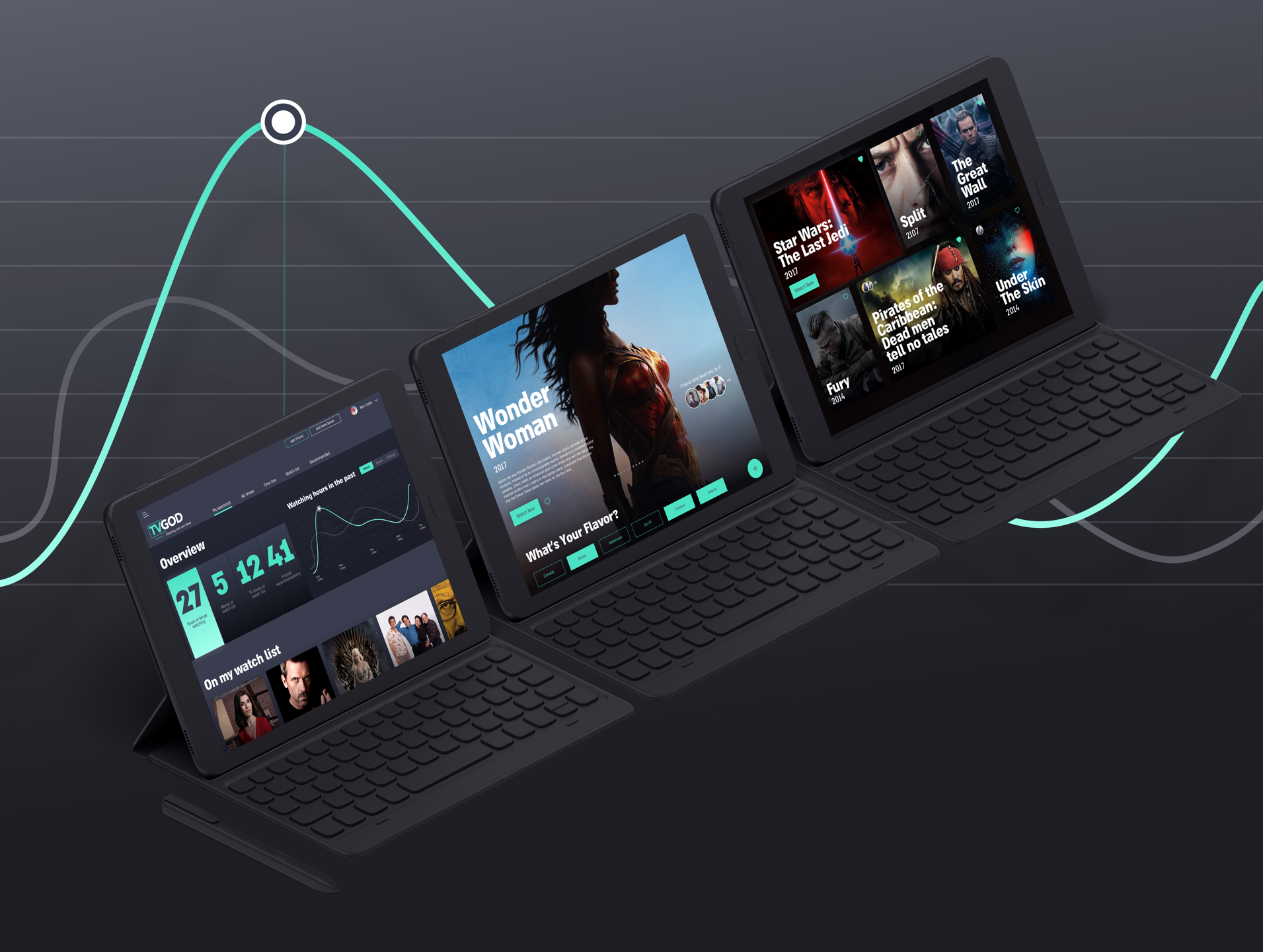
A dashboard that enables watching and saving TV and movie content according to personal preference, and supports sharing with close friends. This dashboard generates statistics for your viewing habits.

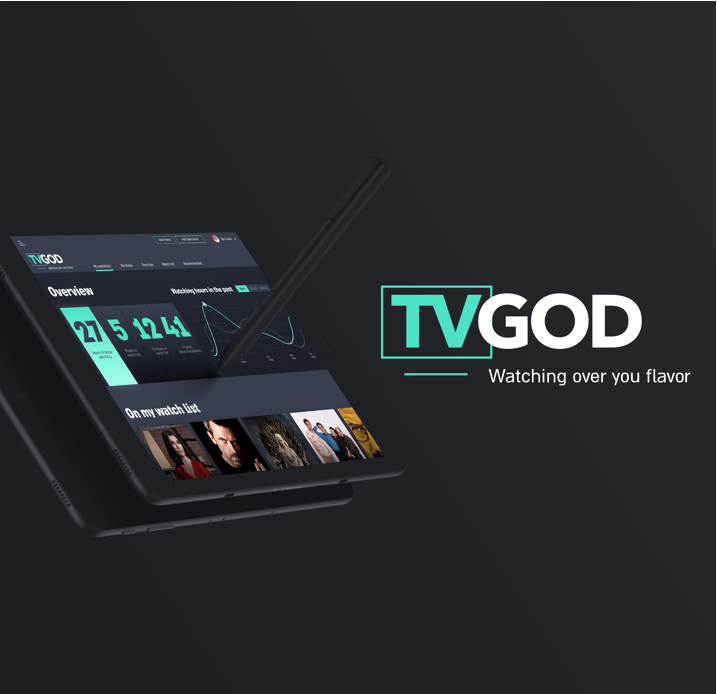
Presenting statistics is not an easy design challenge–and it can be a pretty boring one. In spite of that, the design solution we chose gives the user the information that he needs immediately. For the logo that we designed, we used strong and prominent typography that would convey a strong and determined message: “I’m the god of recommendations.” The design concept continued along those lines–the use of large, clear and bold fonts. The color contrast, use of tabs and minimal graph that is not crowded with information all help convey the statistics in a fast, clear way.


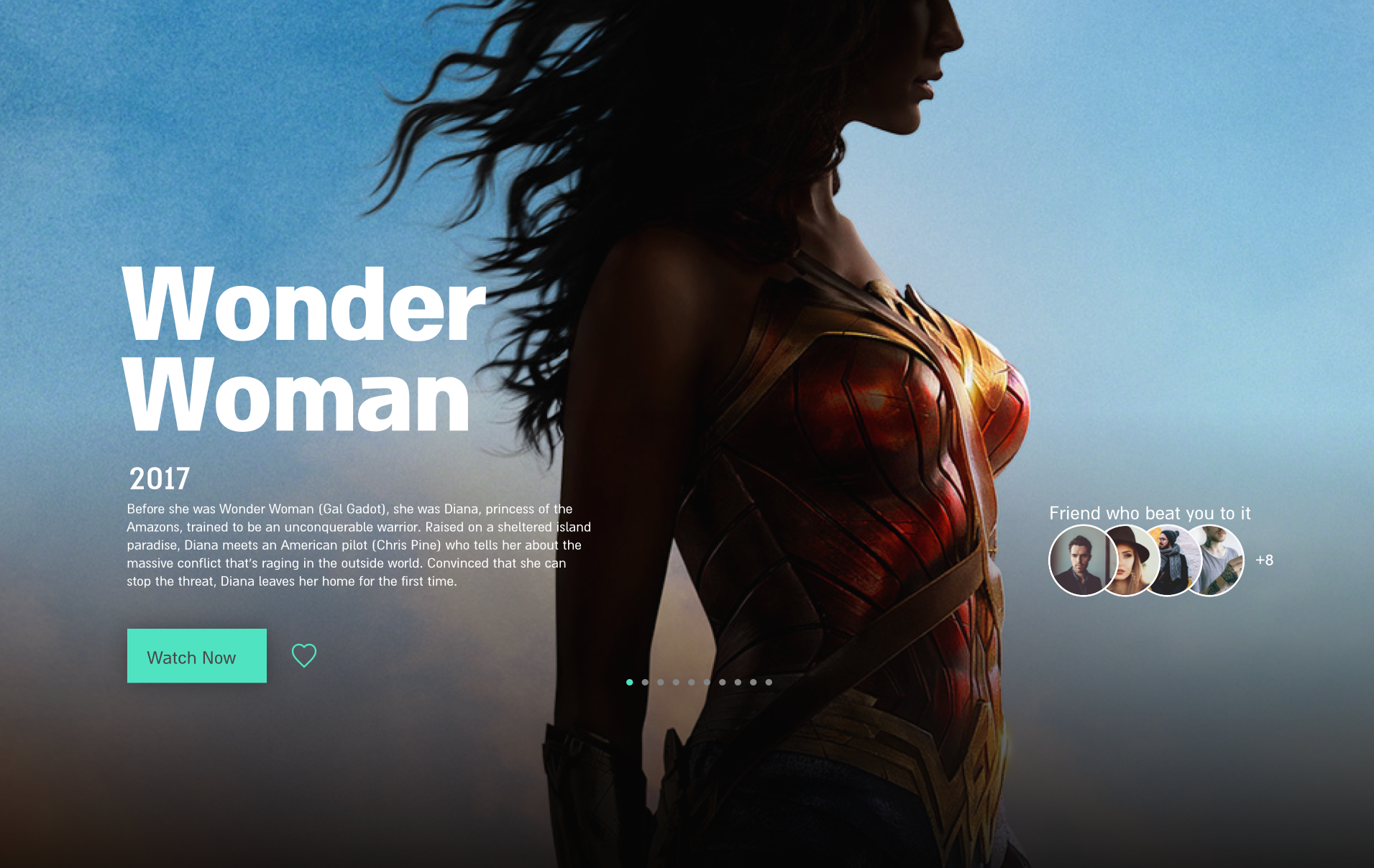
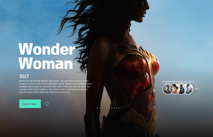
A dark, dramatic background is perfect for movies and TV series content. We automatically think about being in a dark theater. The use of white & mint for the text create a clear, crisp and young contrast.


The leading concept was the use of large, clear typography that appears on top of each movie and in the movie gallery, laid out in a simple grid that provides clear orientation. The use of the Almoni Black font allows the user to filter, add and share his preferences with friends.


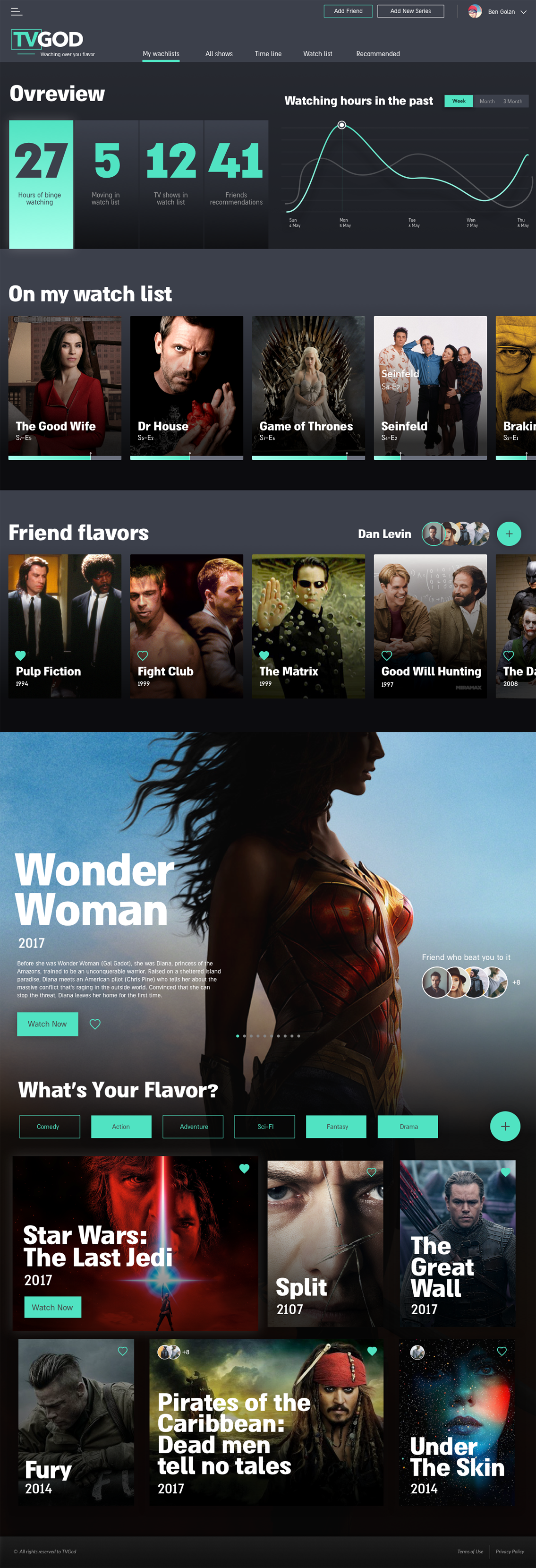
The app’s target audience are 30-40 year olds who want to track their viewing habits, catalogue their preferences and share recommendations with friends. This group likes an orderly, simple viewing experience.