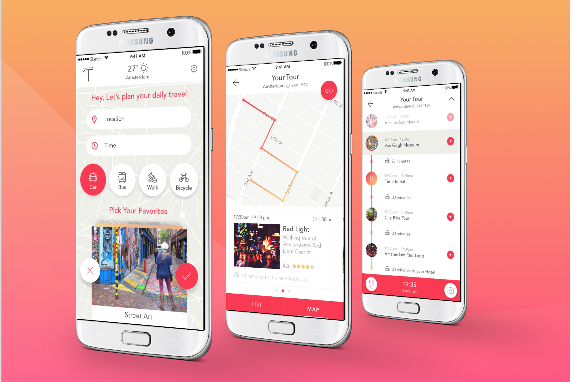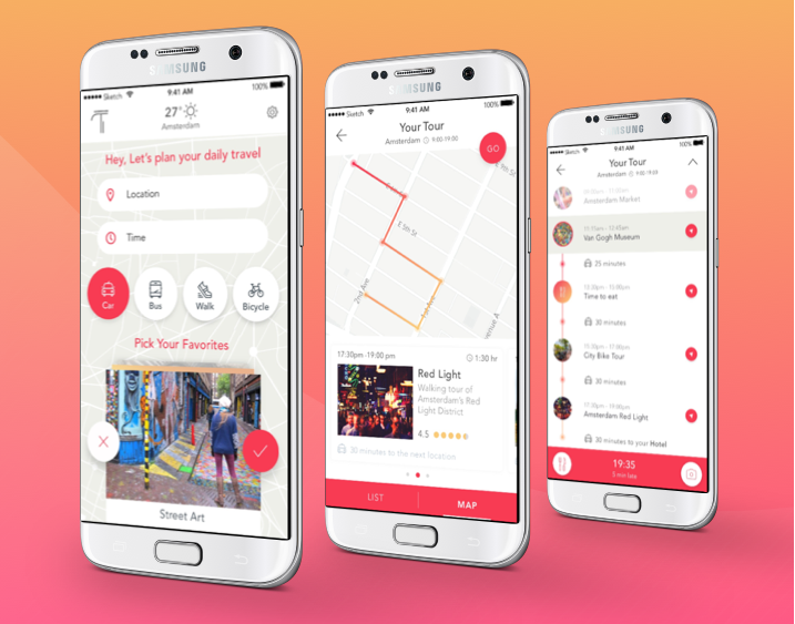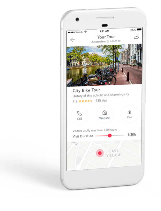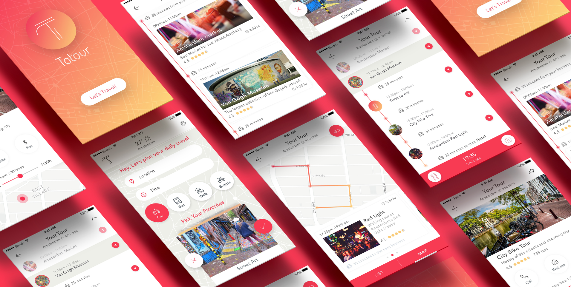

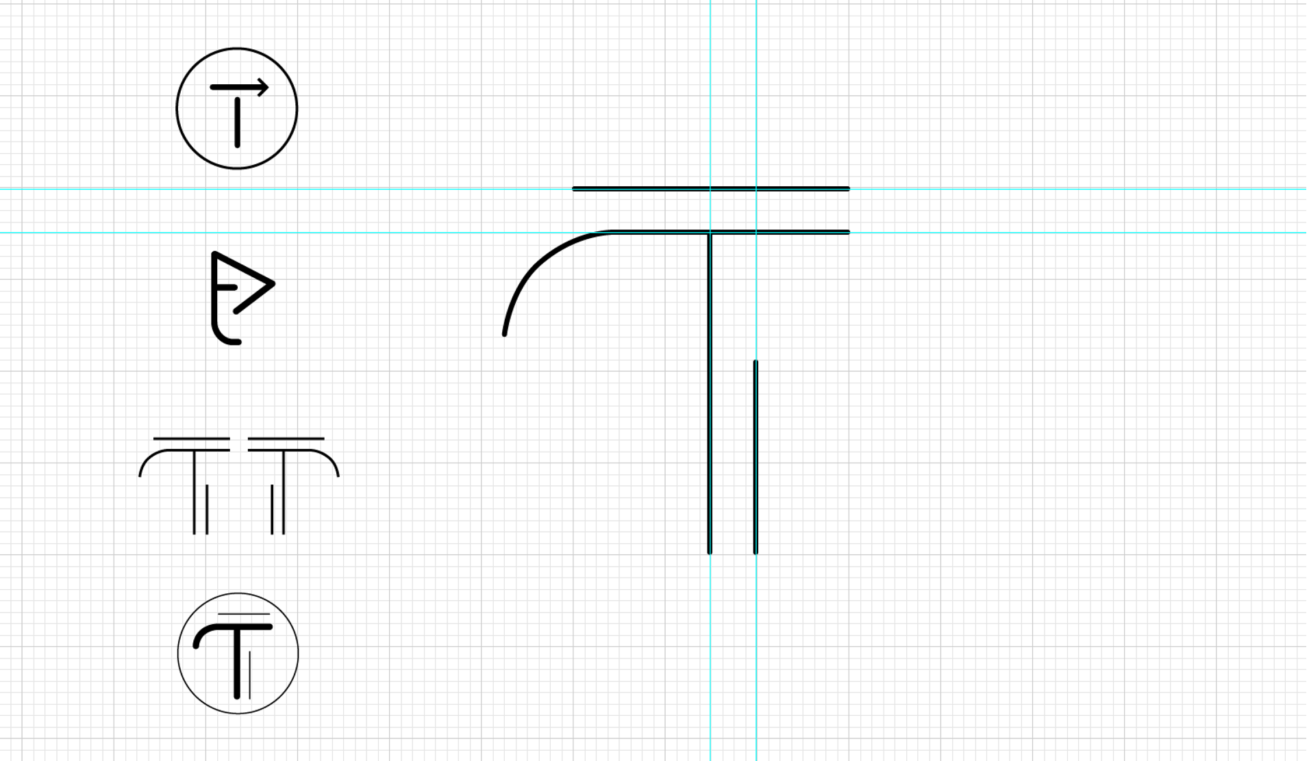
Our brief was to design a mobile app for creating a great personal guided tour. The concept took off when we chose a name for the app, Totour – a combination of “mentor” and “tutor”. A twist of the word created a nice connection and a catchy name. Working on the logo guided the leading design line. We created the letter T from a conceptual and formal connection of map lines and the T junction.

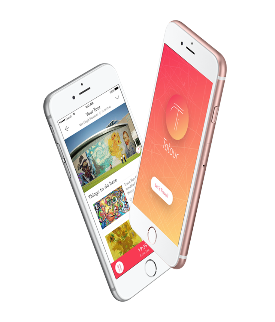
We developed a clean and contemporary design line that includes highlighted colors in light gradient colors of pink and orange. We used the effect of subtle shading to highlight the calls to action zones.
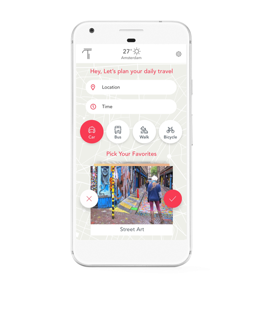
It’s not always easy to get good tips on what to do in a city you don’t know well. Our challenge was to create the experience of a custom walking tour, based on the user’s specific areas of interest and schedule.
Selecting the area of choice, the application builds a perfect guided tour for the user based on their schedule.
