“Lavriuta” is a blog by Lior Baruch, a family doctor. It was born from the necessity to create a ‘feminist’ medicine practice: medicine with a sensitive awareness of how various illnesses meet the patient based on sex and gender. Dr. Baruch wished to advance equal treatment for women, GBLT, and ethnic minorities that do not receive the optimal care.
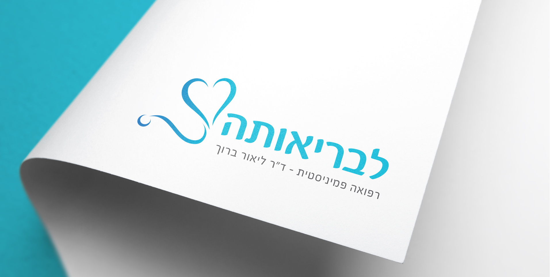
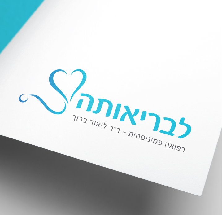
We wanted to combine elements of medicine and feminism, without being stereotypical or obviously feminine. We searched for a logo that will best convey a message of attentiveness and heart, appealing to this wide community. A family doctor practice, that also happens to be a feminist.
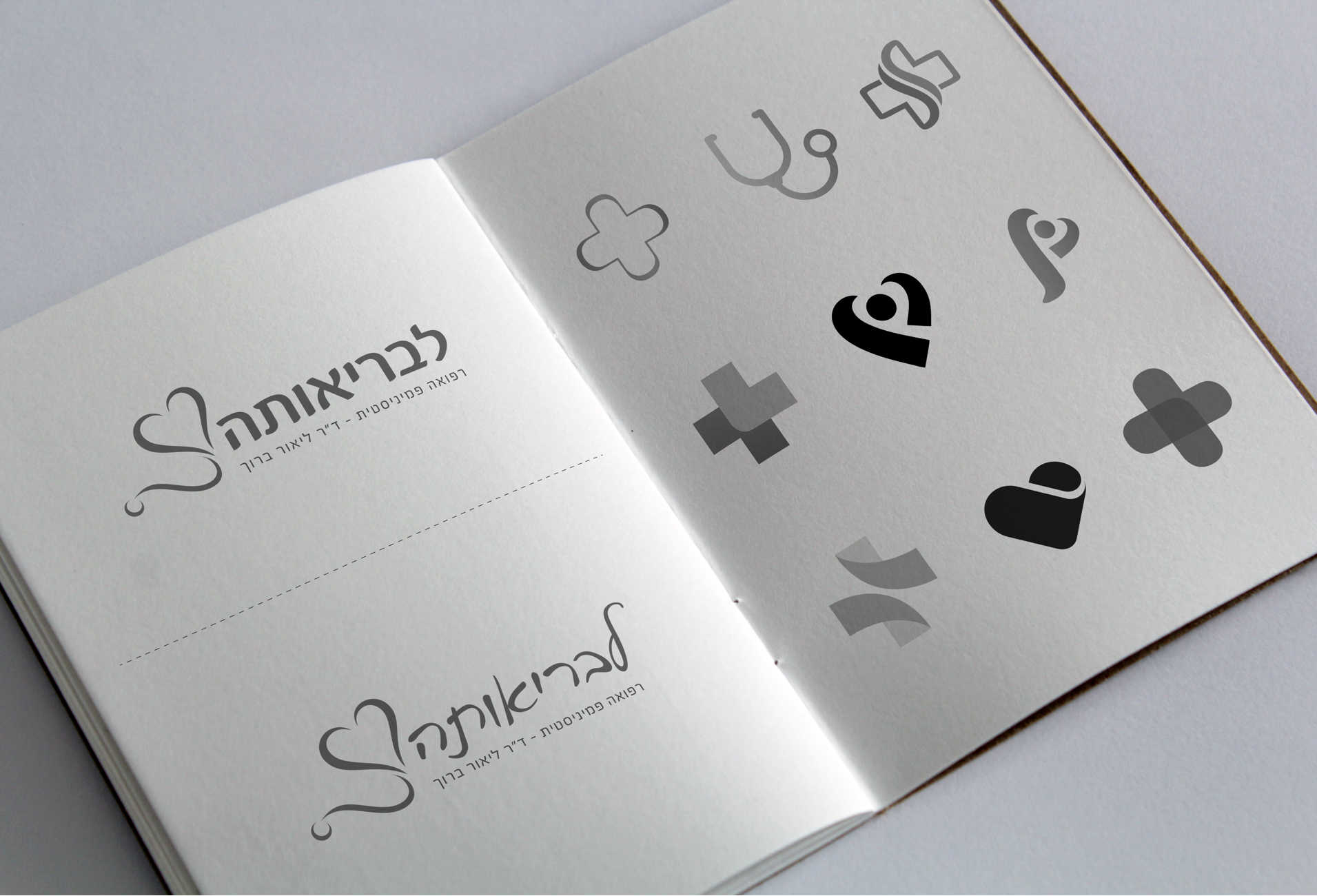

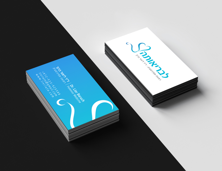
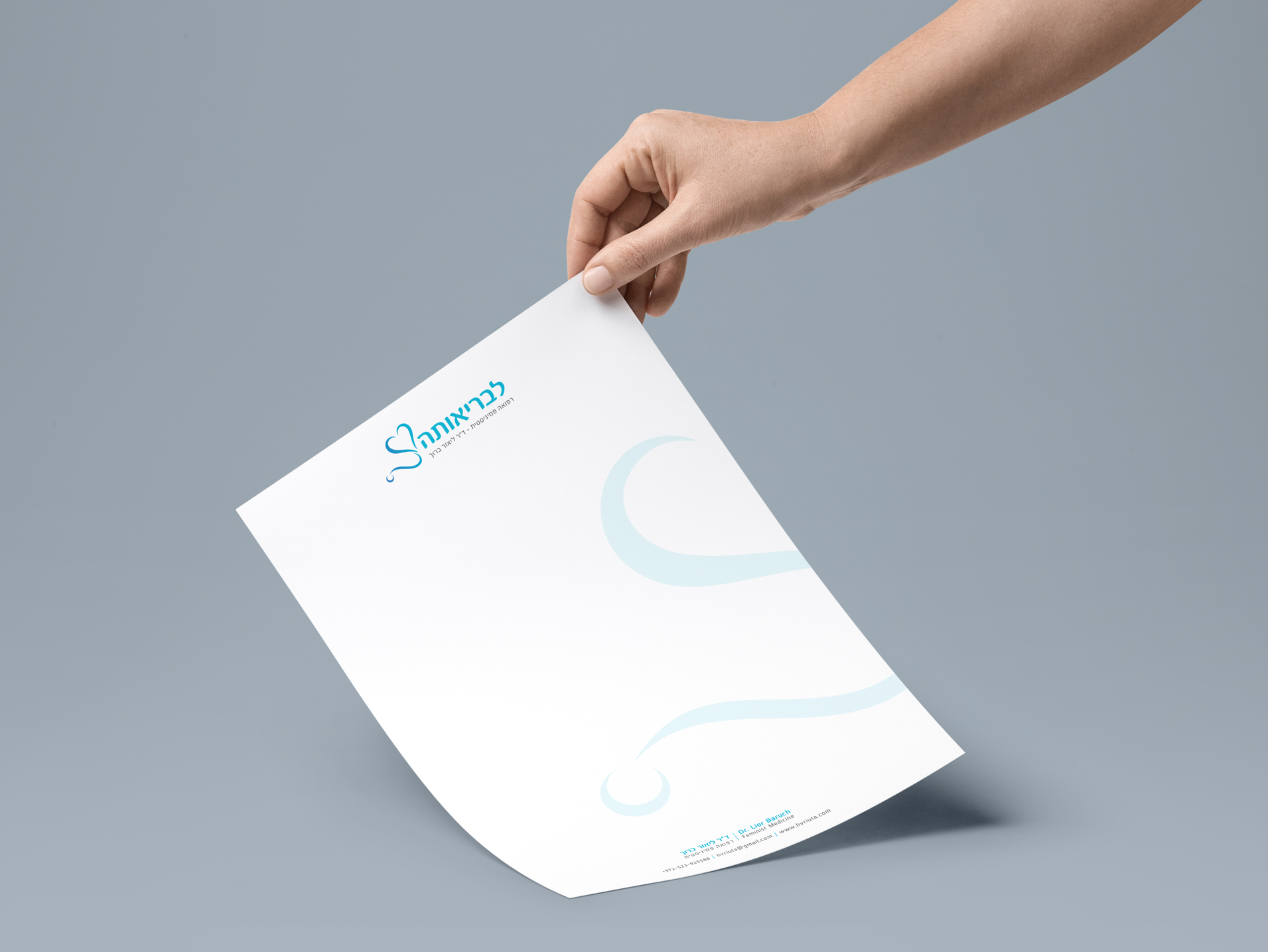
The color choice became clearer as we moved closer to putting together the logo, realizing we do not want to define clearly feminine colors. We used a Turquoise gradient on the statoscope, adding to the sense of dynamic movement. We complemented it with Grey, so as not to create a dominance with a strong Black. This combination created the effect Dr. Baruch was looking for: confident and calm, with a natural flow, like the creation of life.


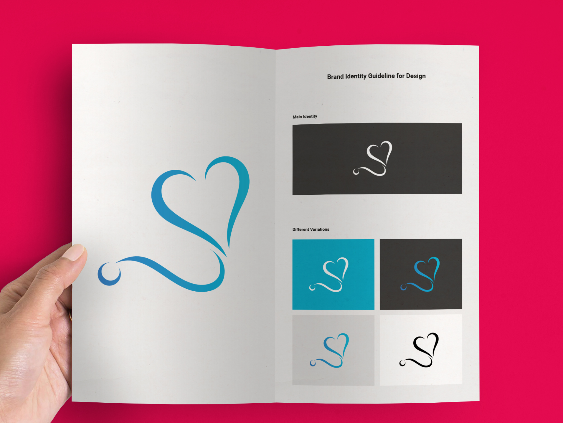

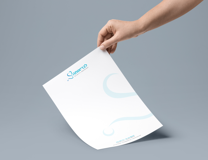
Once the logo was complete, we dressed up all of the on-line and print materials with it: blog, Facebook page, mail signature, business cards and stationary.