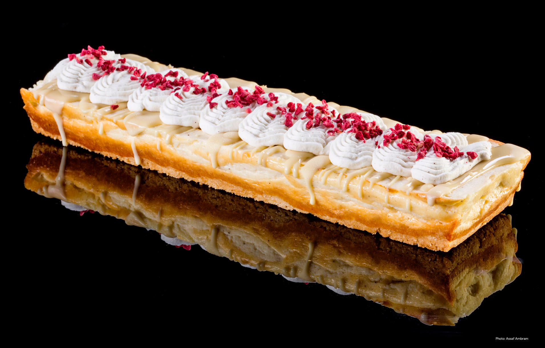
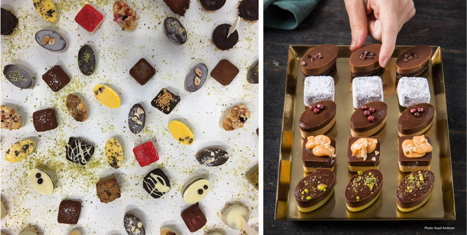
Jordi is a specialty bakery serving bite-size desserts, offering an array of tasty small Petitfors in an assortment of textures and colors. At Jordi they believe that food is a way of life, a way of combining creativity, great taste, and human connection. They bring this into their deserts with great love.

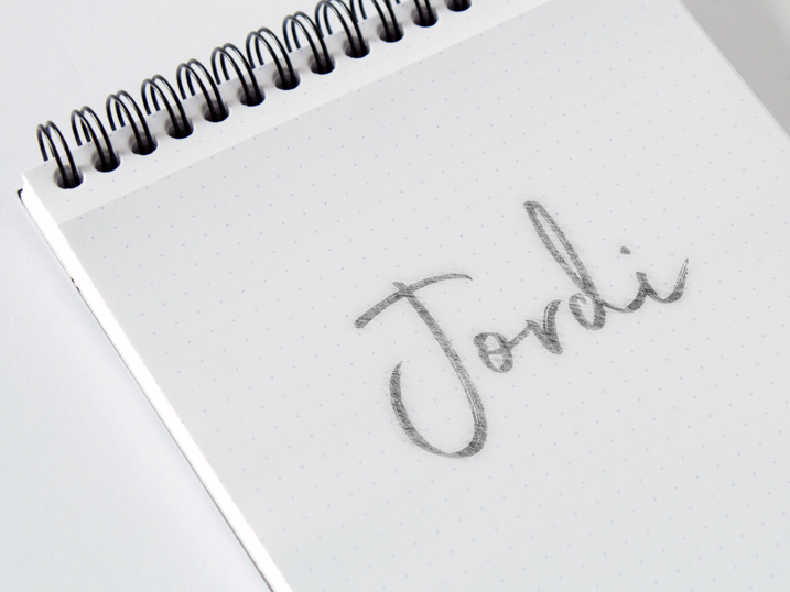
When Shahar & Sharon, the owners of Jordi, were trying to come up with a name for their place, they knew they wanted it to have meaning and elicit a smile on their faces. They wanted it to be fun and full of life, to represent an endless love for food and the company of others. We knew this had to inspire the design of the logo and result in something that is young and vibrant.

The brand came to us with existing colors of black and grayish-silver. Each variety of olive also has an identifying color. So we stuck with the brand’s colors and emphasized its images instead. This decision also helped create a classic, clean, magazine-like appearance.


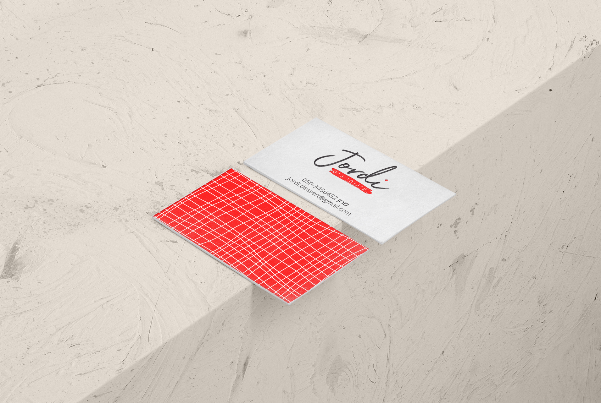

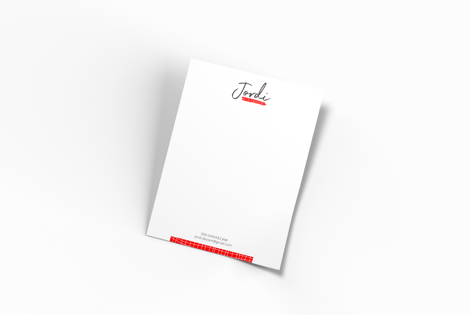
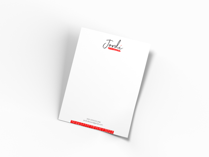
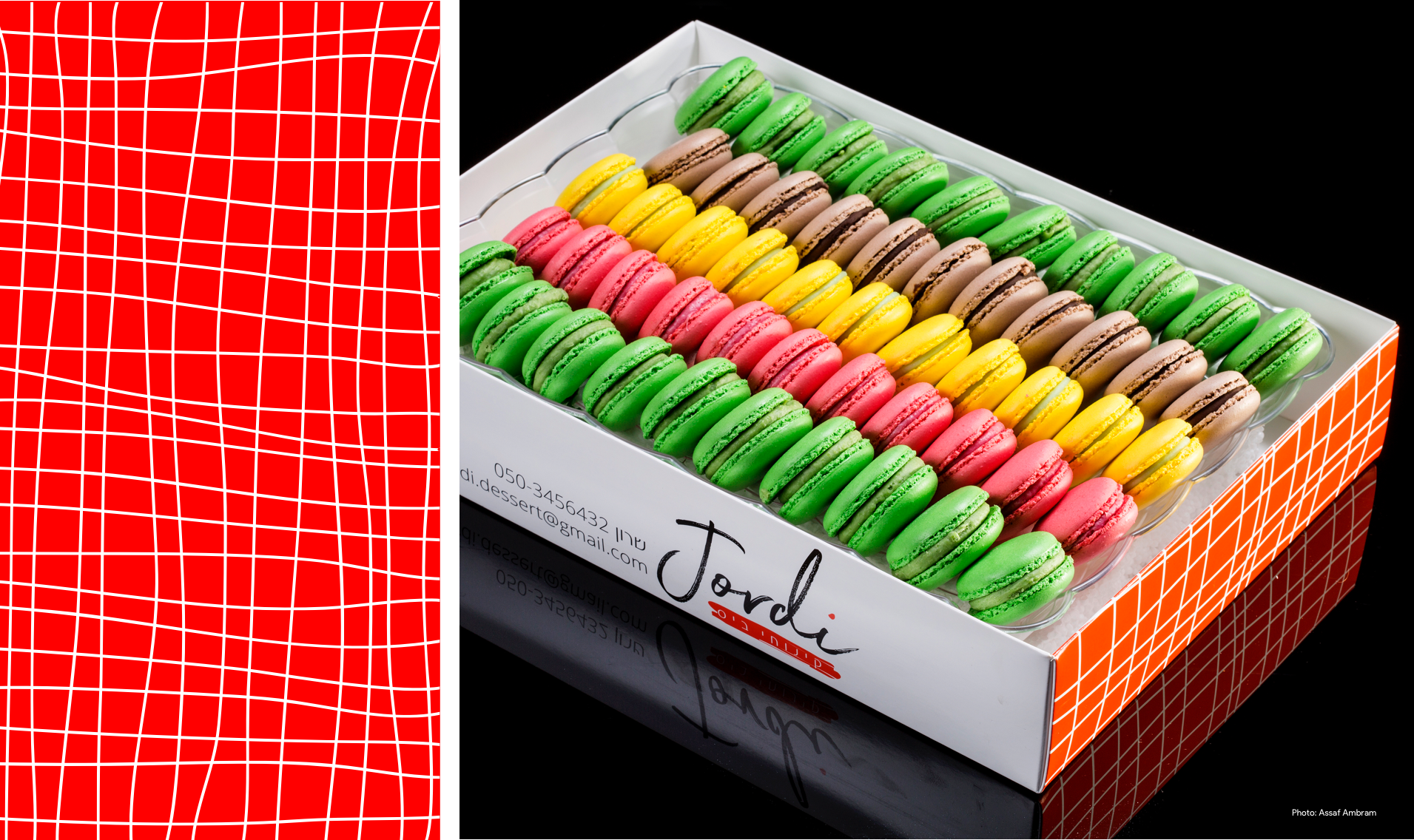
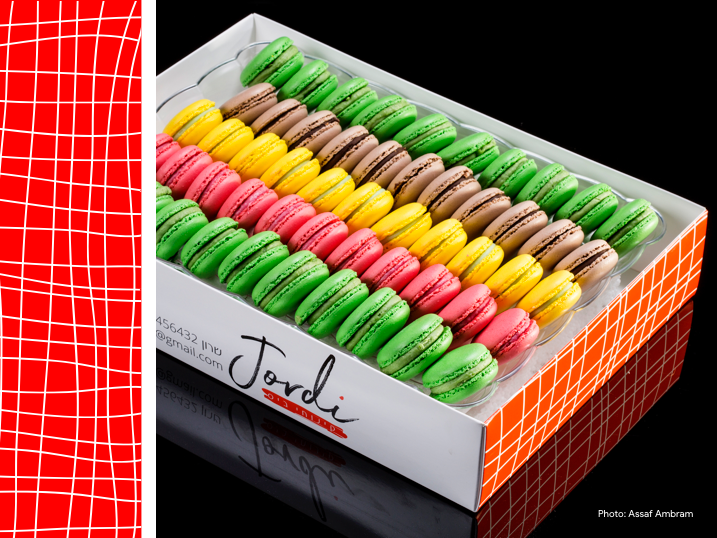
The deserts display, their shapes and arrangement, reminded us of a grid. This lead to a texture we designed. It combined well with the logo, written in free style handwritten letters. A clean, elegant line that is also free. The design language carried through business cards, stationary, cake labels and packaging.