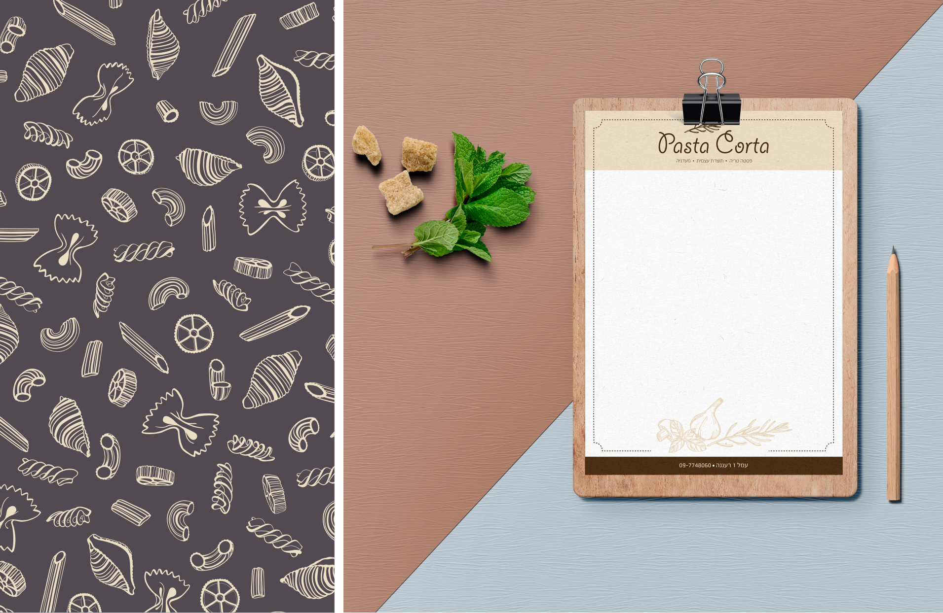
Pasta Corta is a small Italian restaurant in Ra’anana, where the pasta is hand made just like in the small villages of Italy. The owners believe that “Good, simple, wholesome food should not be expensive or complicated”. The meaning of the name is ‘short pasta’.
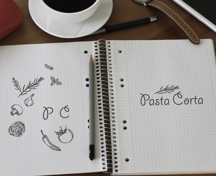
We designed the logo with playful letters that hint to pasta shapes, which, like the restaurant, do not take themselves too seriously. Clear, concise and simple. It makes no pretense of sophistication, just like homemade food you find in small villages in Italy. We added a sprig of Rosemary, the ultimate herb for pasta.

We decided to go for natural colors, choosing the creamy color of pasta dough. Combined with a greyish brown, the result was a homey feel, a background for the colorful dishes.


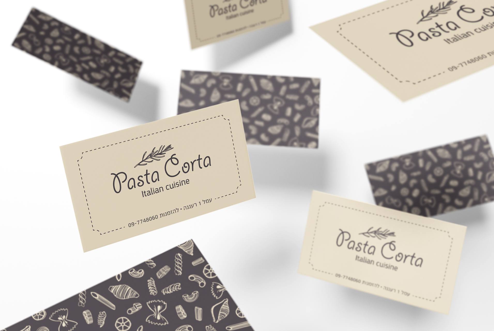
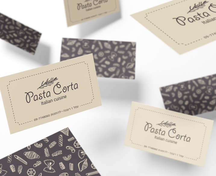
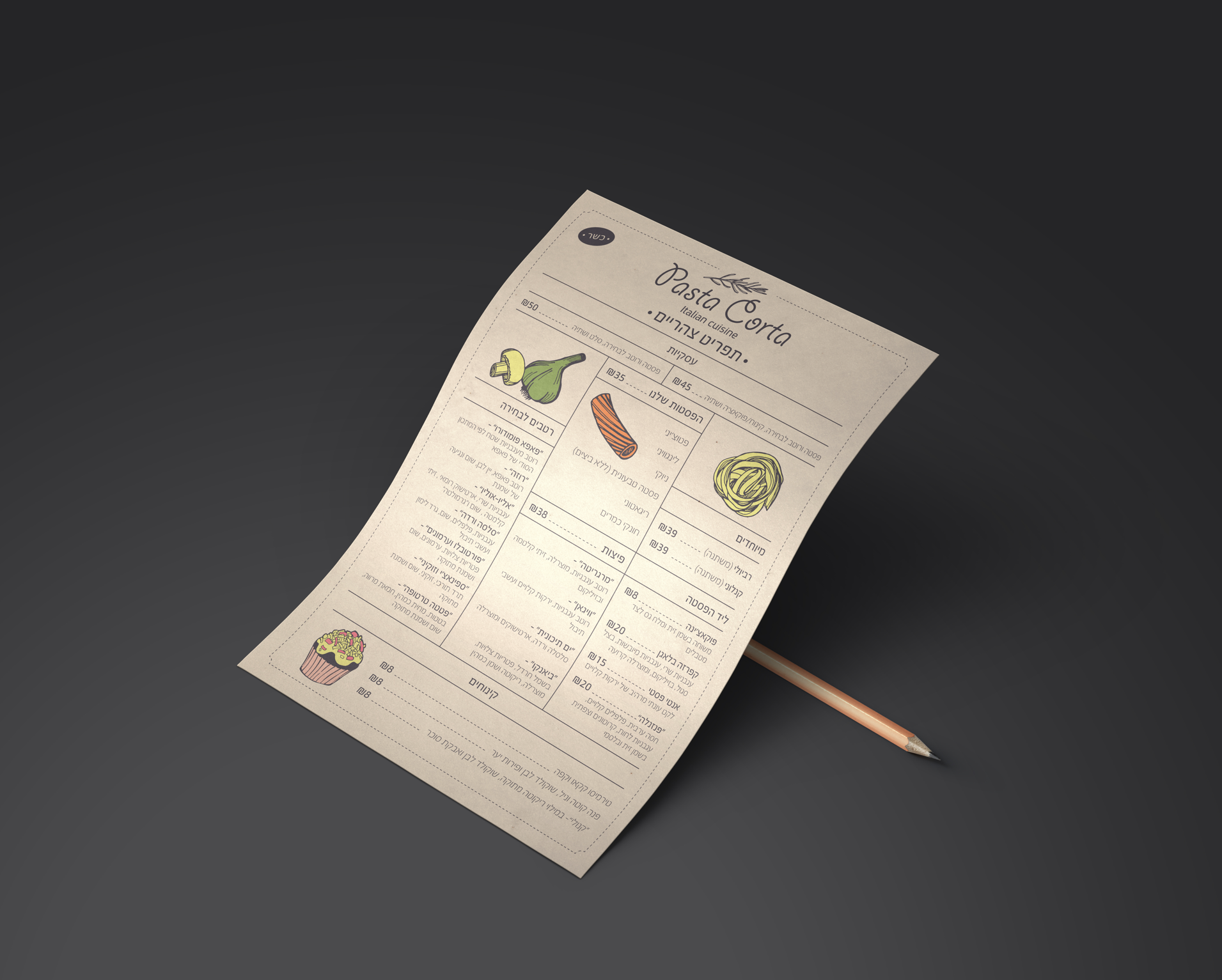
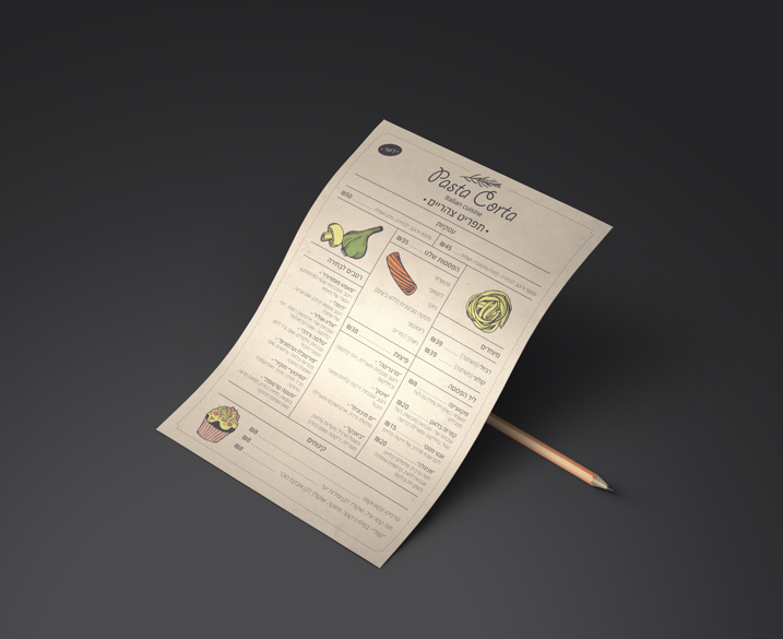
We used the illustrations created when designing the logo to create a texture that enhanced the business cards and stationary. We used small spots of color in some of the illustrations, while some remained single color with a clean line.