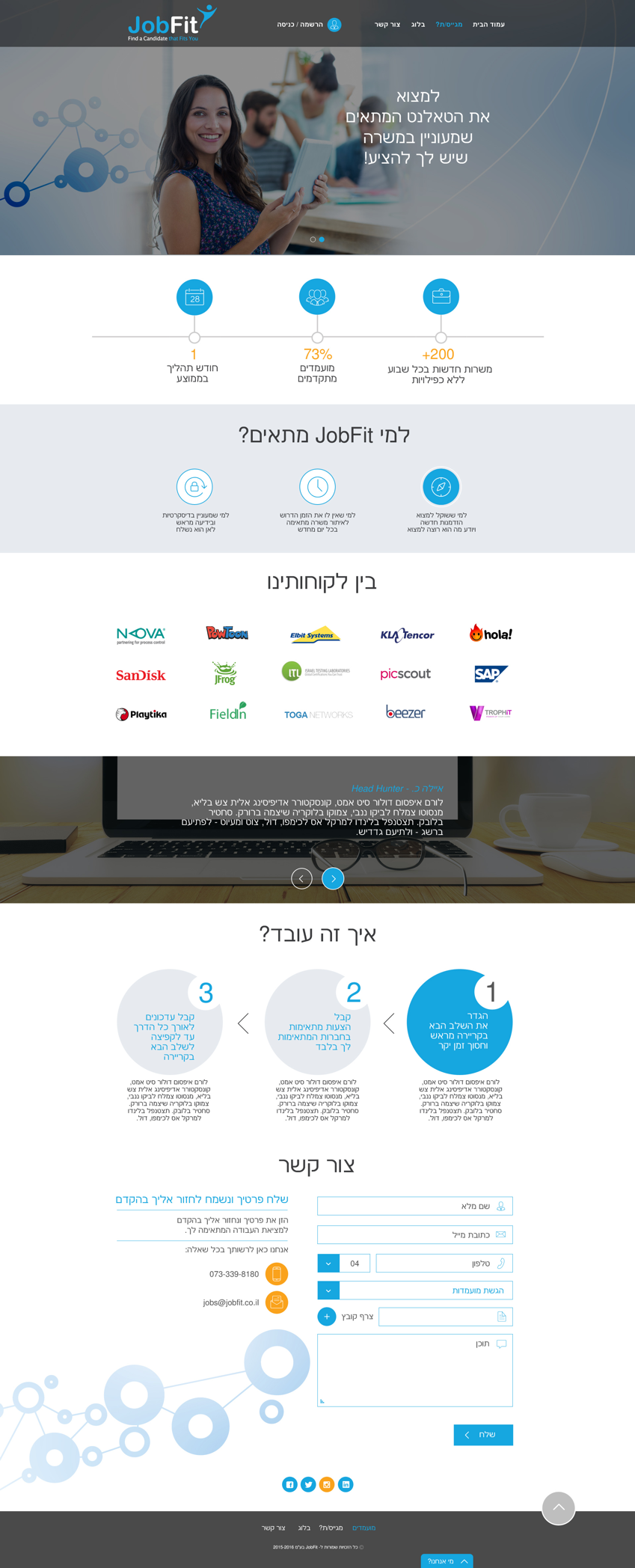
JobFit is a website that links between hiring companies and job seekers, aiming to provide a unique experience in matching the two sides. They put both HR and applicants at the center.
A user-friendly interface supported by sophisticated algorithms and automated analysis tools that predict the best match.
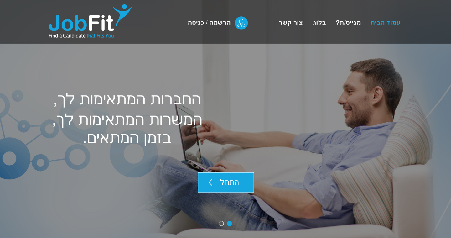

The requirements presented by JobFit made clear the need for two parts, a marketing section that will appeal to companies and job seekers, and the more complex part of registering to the system. The registration process requires many steps, forms and fields, needed so the system can analyze and present its recommendations. Our aim was to create a flow that would not be intimidating or confusing, creating a clear and pleasant experience that reduces the burden.
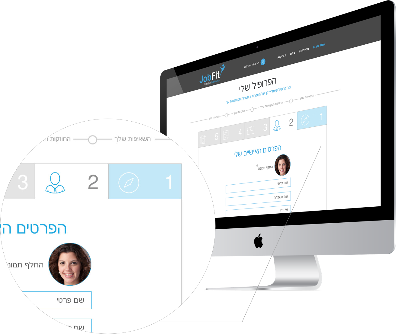
The purpose of tabs is to “reduce the noise”. Numbered tabs, combined with icons symbolizing the topic, we were able to put order into the process of gathering information. This gives the user a clear understanding of where they are in the process, and how much is left. The user can easily jump back and forth in the process.
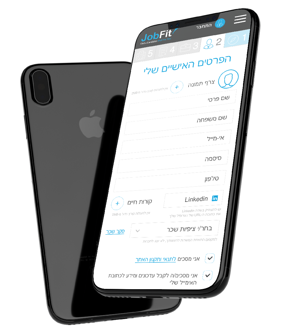
The challenge was creating the same experience in mobile, making sure the design is adapted and adjusted for best user experience. We decided on ‘sticky’ tabs at the top of the screen, keeping the awareness of where in the process and the ability for navigating back and forth.
The color pallet needed to converse with the company’s logo, blue-grey-white. We added orange to create a contrast, while keeping the clean design and making use of white space to reduce visual overload.
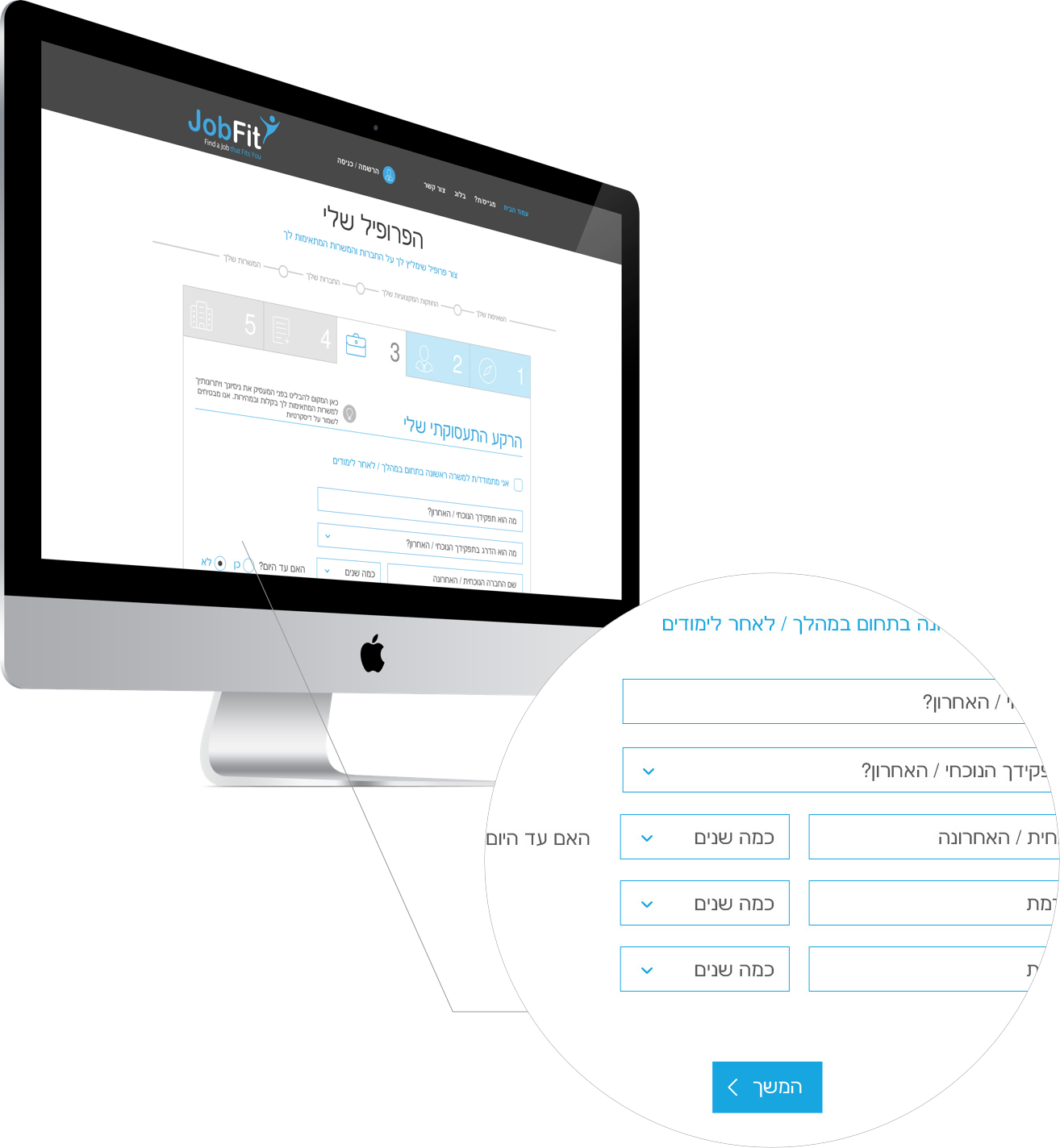
We chose Nachlieli, an elegant and clean font, which lends itself to headers, field text and comments (readable even in small font). We chose a large font size for field text entry, with large spacing, for easy readability. We used white background to lighten the load and create order in the complex forms.
