Anna Revik-Nashiv is a life style coach, practicing medicinal nutrition, aromatherapy, Bach flowers and iridology. Those who wish to make a life style change receive coaching, and accompanied by Anna throughout the process.
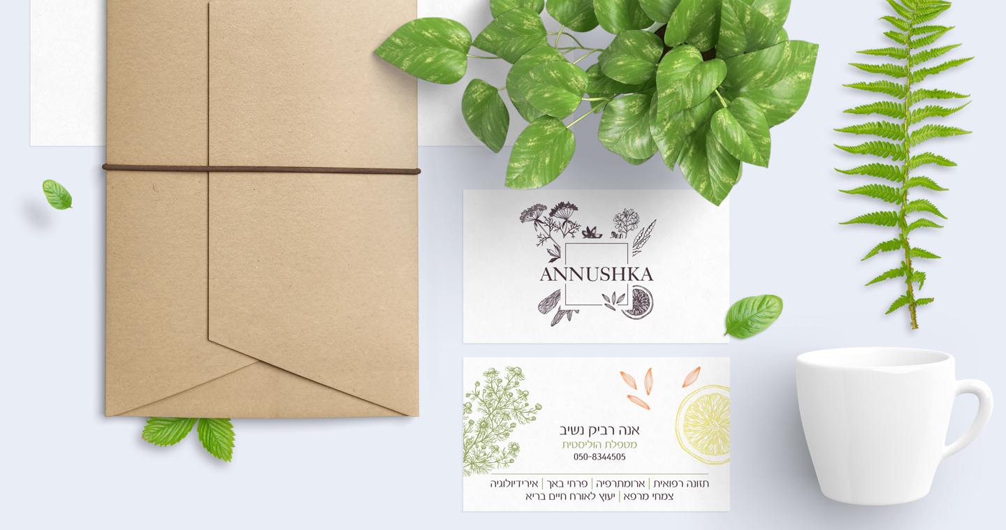
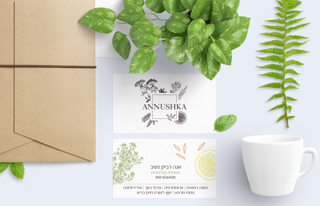
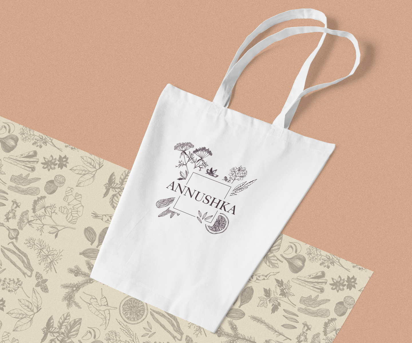
The logo encapsulates everything that is the brand. After a few rounds, we found the right balance of structure and suppleness that reflect the essence of the business. We decided to use sketches of plants as an integral part of the logo.
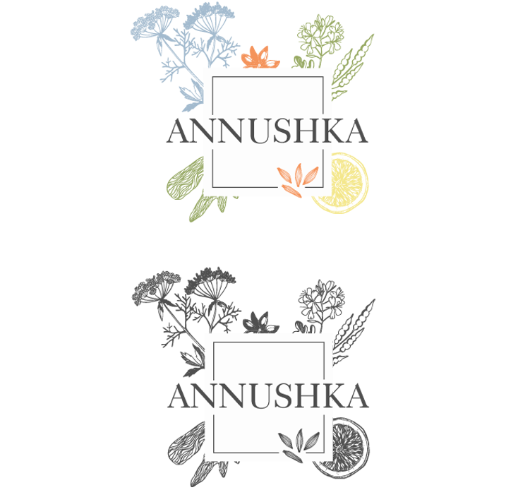
After some consideration, we decided to use a monochromatic scheme of colors. We chose a greyish brown, to provide a natural feel and downplay the color, which highlighted the illustrations of the medicinal plants. Later on, when developing the full design language we decided to add color to some of the illustrations.
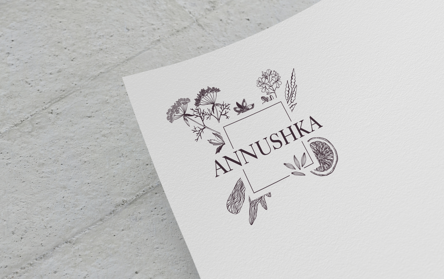
Starting with the plant illustrations, we shaped the texture, and defined a rich design language. We played with color, drawing some illustrations with a light hue of color. The inclusion of a frame in the logo and design language helped convey the message that a healthy lifestyle sometimes requires ‘out of the box’ thinking and operating beyond the comfort zone.

