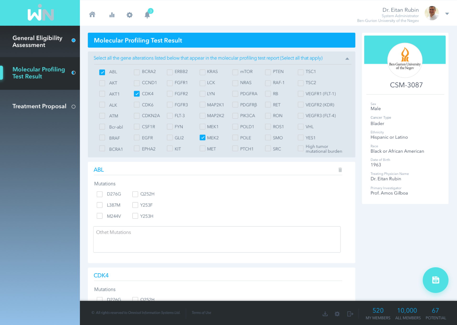
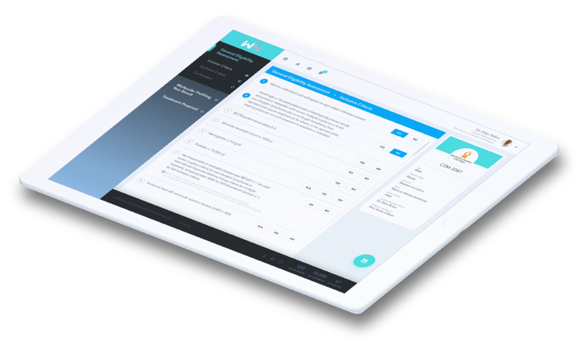
The Clinical Trials System manages all aspects of the trials, from patient registration through data collection, recording staff decisions during the entire course of the trial. When registering a new patient, the treating doctor enters the patient’s medical history, and determines which tests to administer. They are also responsible for recording test results, tracking reactions to medication, and all other information pertaining to the patient.


Registering a new patient, the doctor enters the medical history through the system form. This information is used by a medical committee to determine the course of treatment. Throughout the trial, the doctor gathers and enters the real time data: ordered tests and results, medicines administered, side effects, etc. Our challenge was to design a clear and friendly system, making it easier to understand the vast amount of data entered and interpreted.


We needed to translate the complex analysis document we received from the customer to a simple to use system. The design had to support the large number of use cases, aimed at solving the complexity of understanding the health of the patient at any given time during the trial period.


It was clear to us that a medical system has to have a clean and clear look, simple to comprehend grids, tables and forms that can be easily manipulated. Despite the complexity, we wanted to make sure that it sports a modern, even futuristic, look, representing the groundbreaking research supported by the trials.
The greatest challenge was to create the same experience in mobile. Due to the complexity of the process, the design needed to be adapted to mobile use. We decided on ‘sticky’ tabs at the top of the screen, supporting the user’s awareness of where they are in the process, and the ability to move back and forth.

As this was a medical system, we wanted colors that are pleasing to the eye, without being too happy or morbid. We needed to focus on a look that would reduce the visual load created by the sheer volume of data in the forms and tables.
The system manages several types of research trials, so we created a family of colors for each type, enhancing the user’s ability to discern which type they are looking at.

