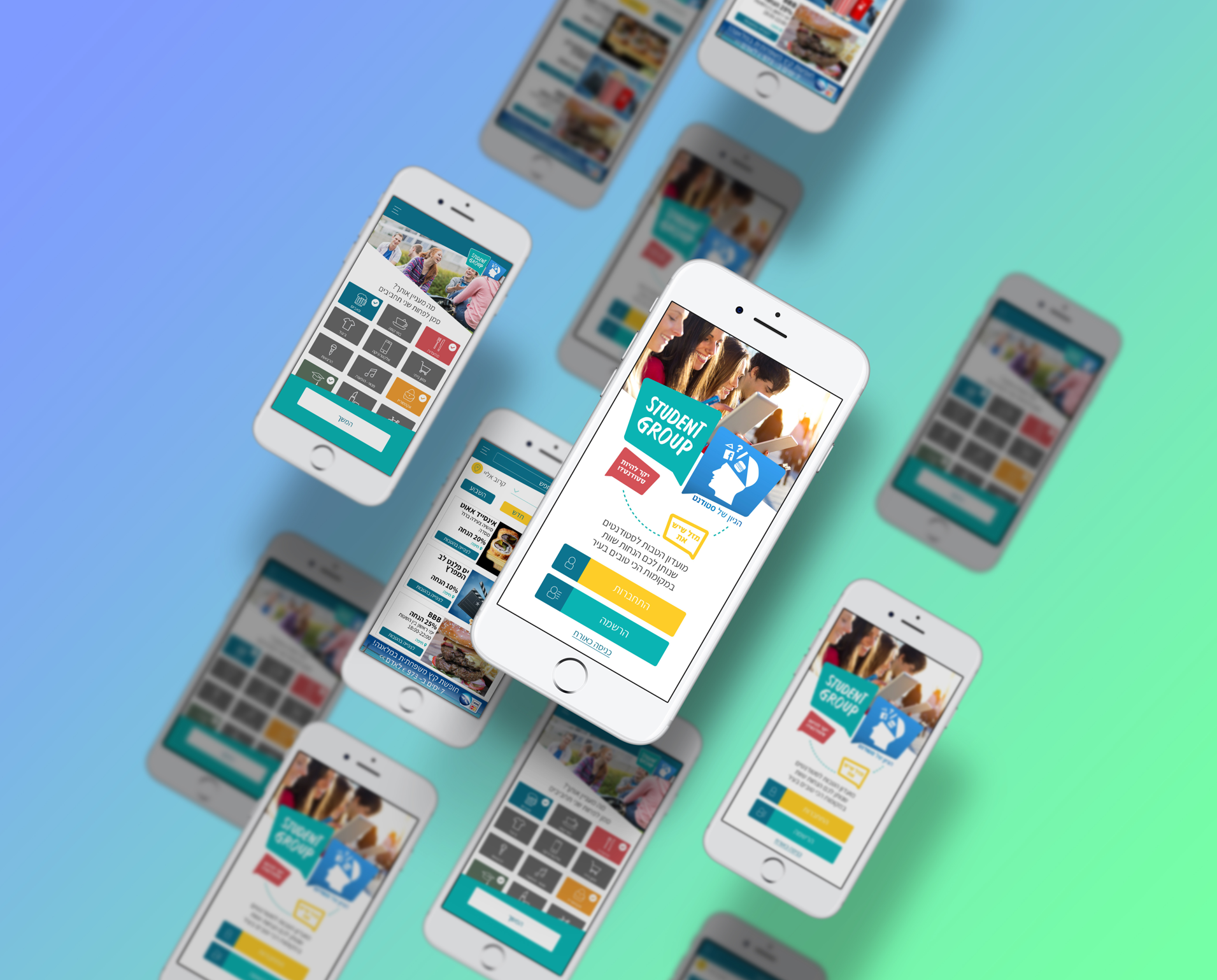
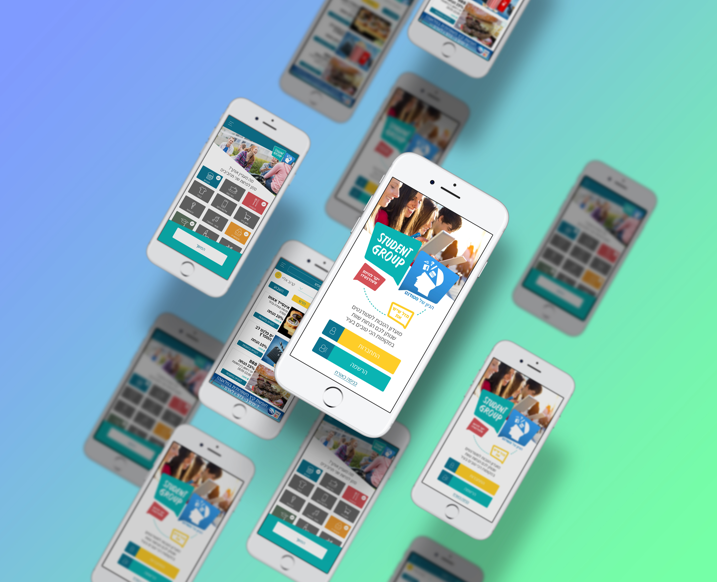
An App and member loyalty club that was created with the goal of strengthening the purchasing power of Israeli students. The club works to create smart purchasing power through a local association of businesses across a variety of areas that provide students with discounts and benefits.
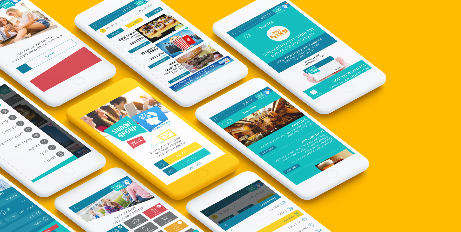

How does it work? You choose a benefit, go to the business’ site and click on “Use a Benefit.” You can use the benefit directly from the main screen as well as clicking on the business’ picture. On the App’s home screen you can see all the latest discounts and participating businesses. You have the option of choosing specific benefits by category or by proximity, no matter where you are at the moment.
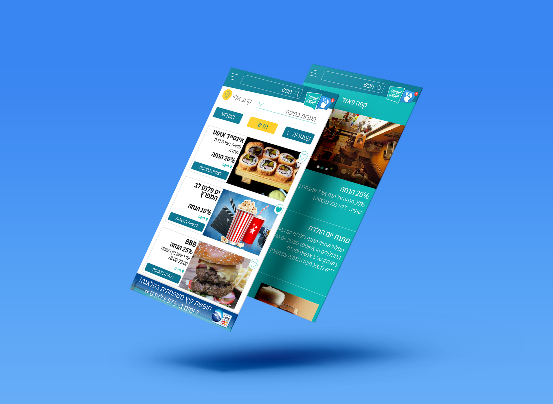
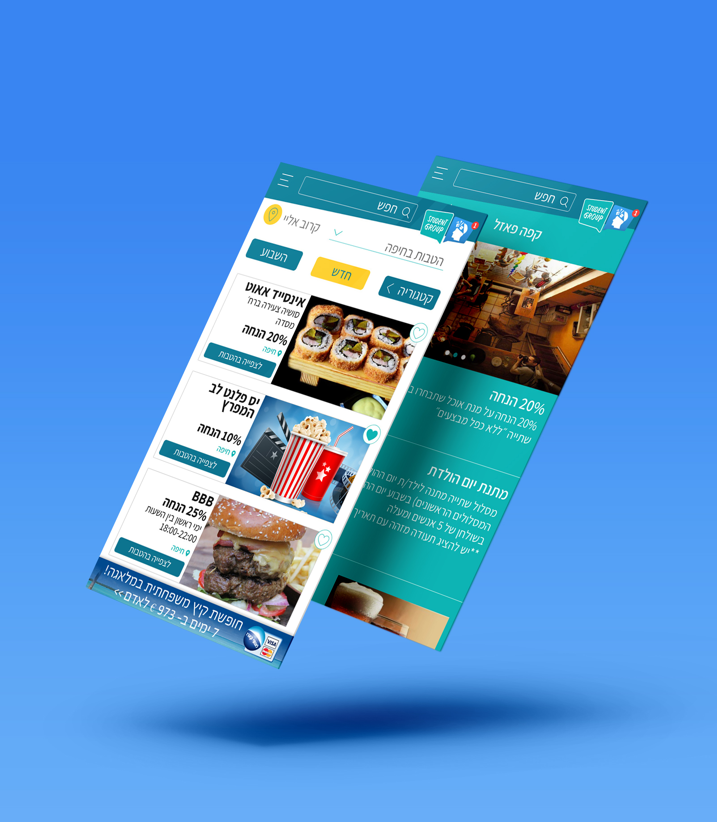
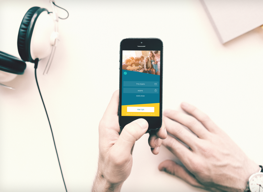
The App’s target audience is young (students), so the graphic language had to be young, dynamic and familiar to its users.
We researched all kinds of Apps that students use on a day to day basis, and finally chose to use a diagonal grid. We chose easy, pleasant colors and pictures of students to create the right feeling. And of course, friendly, eye-level text that supports and completes the rest.
We used the logo’s colors as the basis for our design, so we weren’t afraid to use a wide palette of colors for each topic. We kept to a palette of colors that worked well together, and the result is a colorful and young-looking App that’s perfectly suited to its target users.
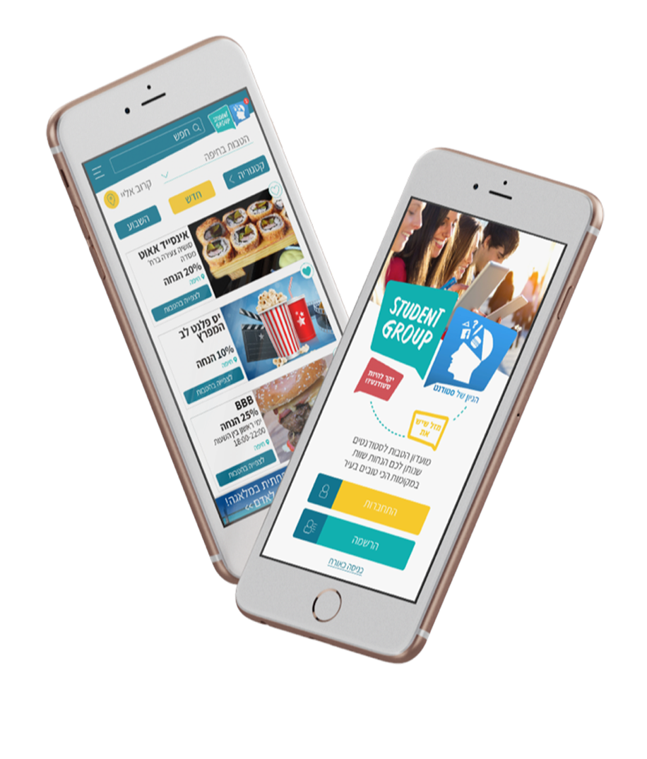

We tried out the icon for each category, trying to create a uniform language of icons We created an icon for each category with a uniform language. The combination of shades created a homogenous color palette. Each area’s color becomes dominant when the user chooses that category, creating clear identifiers when moving from one topic to another.
