Designing an e-commerce site for Swatch is a huge challenge since they’ve done almost everything already. There already have gorgeous and interesting visuals for each one of their collections. Our goal was to come up with an idea that they hadn’t yet thought of.


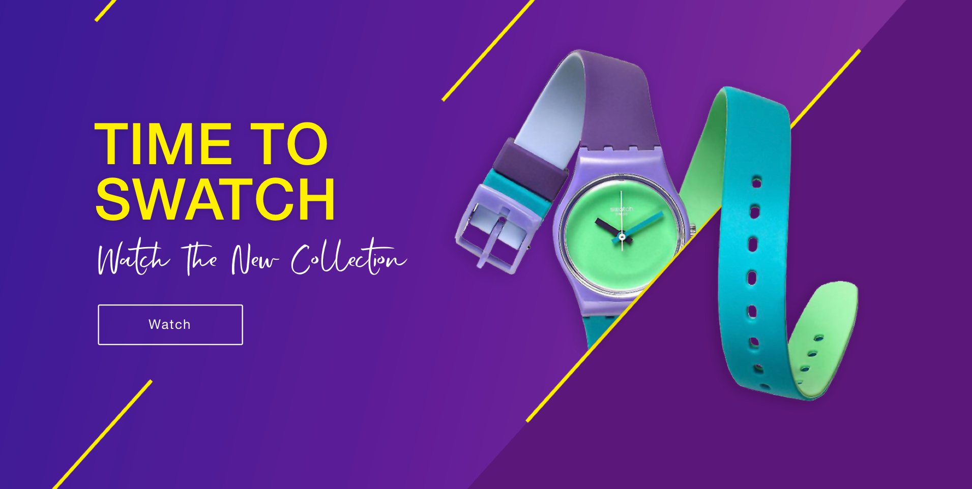
We chose to focus on Swatch’s curved watch collection. These watches have long bands and look more like bracelets, making them so different from the ordinary watch we all know. The inspiration for the design concept came from the watch’s hands. We simplified them into diagonal lines that gave us the right tension and interest in the watch’s curved straps. The visual language for the rest of the site was built on this concept.

We chose to use saturated colors and strong contrasts that speaks to the brand’s youthful target audience. The use of delicate gradients gives the site an updated, innovative and memorable language.


The use of touches of free text also emphasizes the contrast of the rest of the elements that have to be simple and clear for the site’s users.


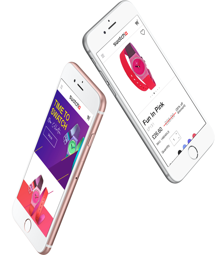
The goal was to clean up the product page as much as possible and to display the information in a clear and organized way. We wanted the buyer to find all the necessary information without creating a crowded visual experience that would cause them to abandon the purchase.


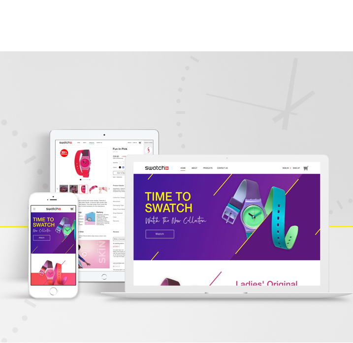
We designed temporary drafts of all the screens. We’re not fans of the “mobile first” or “desktop first” approaches, when we have an idea for a component or layout we try it on several different size screens to make sure it works well.
Sometimes a design that works on desktop doesn’t translate well to mobile-or vice versa.

